Amplify Digital Marketing Corporation - Portfolio Item
Built to Strike a Chord
A Little Vintage. A Lotta Guitar.
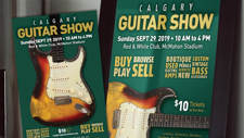
Canadian Guitar Shows needed an identity that felt immediately at home in guitar culture - without simply slapping a guitar silhouette into a logo and calling it a day.
Amplify developed the Canadian Guitar Shows logo and visual identity around two complementary ideas. The overall form takes its cue from the bridge of an electric guitar, giving the mark a subtle connection to the instruments at the centre of the shows.
The typography and graphic treatment reach further back, borrowing some of the character and optimism of mid-century entertainment design — a deliberate nod to the golden-age visual language surrounding guitars, live music and popular culture.
The result feels familiar without becoming nostalgic costume: part guitar hardware, part vintage showbill, and built to look good on everything from posters and T-shirts to websites and show-day signage.
Vintage vibe. Electric heart. Still plugged in.

Related

Guitar Show Event Website
Sector: Entertainment,
Event,
Music
Service:
eCommerce,
Website