Amplify Digital Marketing Corporation - Portfolio Item
Strategy Meets Sharpie
Serious Thinking. Marker Included.
For this change-management consultant, the brand needed to feel professional without becoming corporate wallpaper.
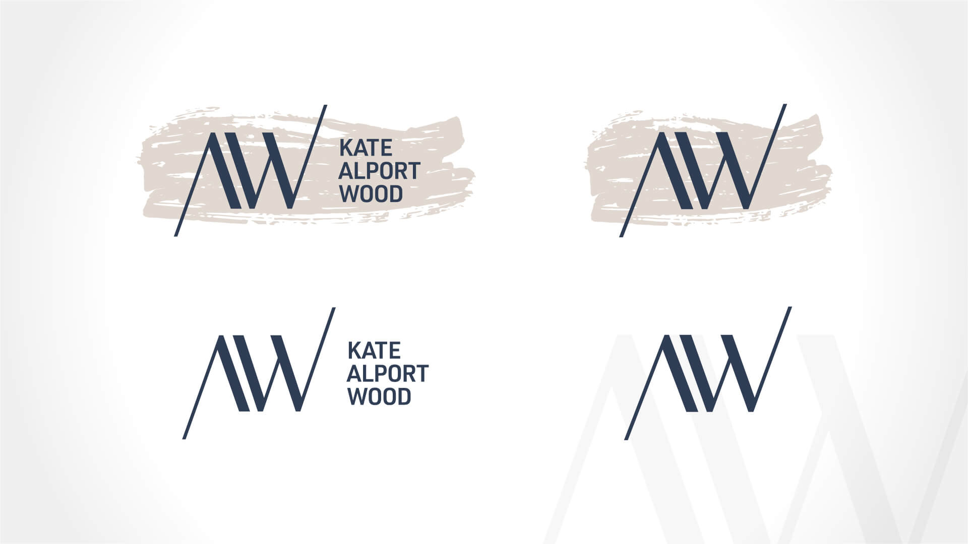
Amplify developed the Kate Alport Wood Consulting logo and visual identity around a distinctive typographic treatment that combines refined letterforms with informal, hand-drawn marker strokes — bringing together the structure of strategic consulting with the human, collaborative nature of organizational change.
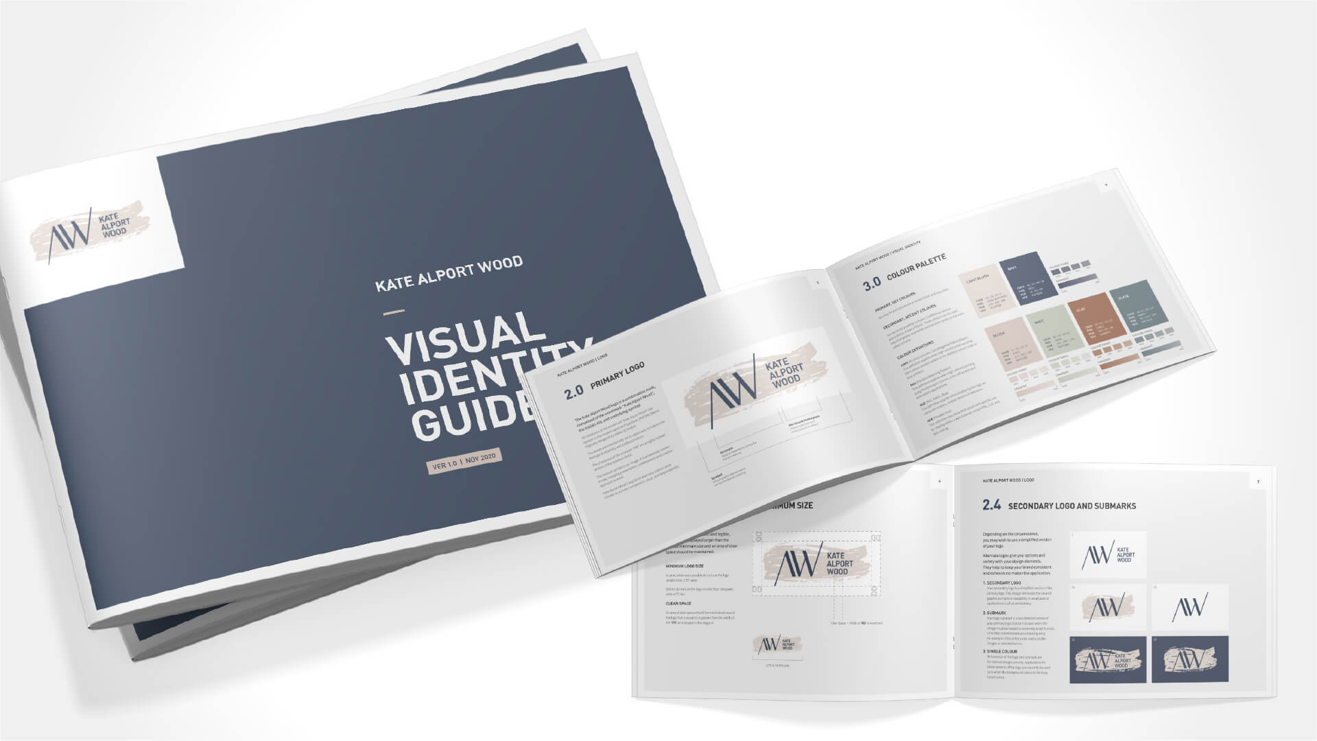
The identity was designed as a flexible system, with multiple logo applications and a comprehensive visual identity guide supporting consistent use across communications and presentation materials.
The result is a consulting brand with just enough imperfection to be memorable: smart, confident, human — and clearly comfortable with change.